

Introduction
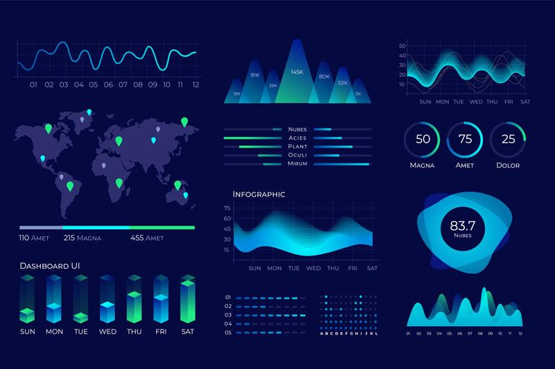
Imagine opening a dashboard and immediately understanding your company’s performance without clicking or filtering. Every chart makes sense. Every color guides your attention. That’s the power of a clean and intuitive dashboard.
In business intelligence tools like Power BI, dashboard design is more than just aesthetics it’s about communicating insights clearly and efficiently. A well-designed dashboard helps users make better decisions faster. Whether you’re new to BI or enrolled in a Power BI crash course, learning to design effective dashboards is one of the most valuable skills you can master.
This guide explores practical, hands-on design tips to help you build intuitive dashboards using Power BI. If you're planning to take Power BI server training, or already exploring a Power BI course, these principles will be essential in your learning journey.
Section 1: Why Clean Dashboard Design Matters
Data Overload Is Real
Users don’t have time to sift through 10 charts. They want to see the most important metrics in seconds. According to a study by Gartner, over 70% of users abandon BI tools if dashboards are cluttered or hard to interpret.
First Impressions Count
In a business setting, your dashboard is your report card. If it looks messy or confusing, it loses credibility even if the data is accurate.
Clean design leads to clarity. Intuitive design leads to action.
Section 2: Understanding Dashboard Design Principles
Before diving into Power BI specifics, you need to understand the core principles of dashboard design.
1. Clarity
-
Eliminate ambiguity
-
Use straightforward language and labels
-
Avoid overly technical jargon
2. Consistency
-
Use consistent color schemes and fonts
-
Standardize chart types for similar data
3. Focus
-
Highlight key performance indicators (KPIs)
-
Remove unnecessary visuals or duplicated insights
4. Hierarchy
-
Use size and position to guide attention
-
Put the most important visuals at the top or top-left (F-pattern scanning behavior)
Section 3: Effective Layout Tips in Power BI
Start with a Wireframe
Before building your dashboard in Power BI, sketch the layout. Think of your layout as zones:
-
Header: Dashboard title, date range, filters
-
Summary Section: High-level KPIs
-
Details Section: Charts and comparisons
-
Footer or Notes: Annotations or definitions
This approach helps simplify navigation and sets clear expectations for your users.
Use Grid Alignment
Power BI supports gridlines and snap-to-grid features. Use these to keep visuals aligned. Misaligned visuals create visual clutter and confusion.
Pro Tip: Use uniform margins and padding between visuals to create breathing space.
Section 4: Choosing the Right Visuals
Match Visuals to Questions
Each visual should answer a specific business question. Here’s a quick guide:
-
Card Visuals – Perfect for showing KPIs like Total Sales or Active Users
-
Bar/Column Charts – Best for comparing categories
-
Line Charts – Great for trends over time
-
Pie/Donut Charts – Use sparingly, best for percentage breakdowns
-
Maps – Use for geographic data distribution
-
Tables – Ideal for detail-level data but can be overwhelming if overused
Avoid Overusing Fancy Visuals
Custom visuals can be appealing, but they often distract from your message. Stick with standard visuals unless a custom one significantly improves clarity.
Section 5: Color and Typography Best Practices
Use Color Intentionally
Color is one of the most powerful tools in dashboard design but only if used well.
-
Use consistent color for the same metrics across pages
-
Reserve bright or bold colors for alerts or key insights
-
Limit your color palette to 3–4 complementary tones
Example: Use green for positive trends, red for negative, and gray for neutral values.
Typography Matters
-
Font Choice: Use clear, readable fonts like Segoe UI or Arial
-
Font Size: Title (18–24 pt), Axis Labels (10–12 pt), Data Labels (12–14 pt)
-
Avoid All Caps: It reduces readability
Section 6: Creating Interactive Dashboards in Power BI
Interactivity is one of Power BI’s strongest features. But without proper control, interactivity can lead to confusion.
Use Filters and Slicers Wisely
-
Use slicers for fields users often want to filter (e.g., Date, Region)
-
Limit the number of slicers to avoid clutter
-
Use dropdown slicers to save space
Enable Drillthrough and Tooltip Pages
Drillthrough lets users click on a data point to see a more detailed page. Tooltip pages provide additional info on hover.
Example: In a sales dashboard, clicking on a region can open a detailed breakdown of sales reps or product performance in that region.
Section 7: Real-World Dashboard Design Examples
Case Study: Sales Performance Dashboard
A global retail company built a Power BI dashboard to monitor regional sales. They applied these design principles:
-
Placed key metrics (Total Sales, Growth %) at the top
-
Used consistent bar charts to show regional comparisons
-
Applied color-coded KPIs to highlight underperforming areas
-
Added a dropdown slicer for year and region filtering
Result:
-
User engagement increased by 50%
-
Executives were able to make decisions 30% faster
-
Data errors and misinterpretations dropped by 40%
This type of project is often covered in an advanced Power bi crash course or included in a final project in a Power BI course.
Section 8: Hands-On Design Walkthrough in Power BI
Let’s walk through how to design a basic dashboard in Power BI using clean design principles.
Step 1: Import Data
Open Power BI and import a sample dataset like sales data or customer feedback.
plaintext
Home > Get Data > Excel > Select File > Load
Step 2: Create KPIs Using Card Visuals
Use the Card visual to display:
-
Total Sales
-
Average Sales per Transaction
-
Number of Active Customers
plaintext
Visualizations > Card > Drag Measure to “Values”
Step 3: Add Trend Chart
Use a line chart to show monthly sales trends.
plaintext
Visualizations > Line Chart > Axis: Month, Values: Sales
Step 4: Add Bar Chart for Regional Comparison
plaintext
Visualizations > Bar Chart > Axis: Region, Values: Sales
Step 5: Add Slicers
Use dropdown slicers for Year and Region.
plaintext
Visualizations > Slicer > Field: Year > Change to Dropdown
Step 6: Format for Clean Layout
-
Use snap-to-grid
-
Align visuals evenly
-
Apply consistent font and color scheme
Result: A clean, user-friendly dashboard in under 30 minutes.
Section 9: Common Mistakes to Avoid
Even experienced Power BI users fall into design traps. Here’s what to avoid:
1. Overcrowding the Page
Too many visuals overwhelm users. Stick to 4–6 visuals per page.
2. Unclear Labels
Never assume users will understand abbreviations or column headers.
3. Ignoring Mobile View
Check how your dashboard looks on smaller screens. Use mobile layout optimization in Power BI.
4. Lack of Context
Always include units (e.g., USD, %) and timeframes (e.g., Q1 2025) on your visuals.
Section 10: The Role of Power BI Training in Design Mastery
If you’re serious about designing better dashboards, enrolling in a Power BI course is a smart move. These programs often cover:
-
Visual design fundamentals
-
Data modeling for performance
-
Real-world dashboard projects
-
Interactivity and user experience
What to Expect in a Power BI Crash Course
-
Overview of the Power BI interface
-
Hands-on practice with data visualization
-
Quick wins in formatting and layout
-
Templates and reusability strategies
Power BI Server Training: Going Advanced
For enterprise-level dashboards, Power BI training covers:
-
On-premise deployment
-
Row-level security
-
Custom branding
-
Version control for dashboards
These skills are essential if you're building dashboards for a large team or managing sensitive data.
Conclusion
Clean dashboards aren’t just pretty, they are powerful decision-making tools. With tools like Power BI, the ability to design intuitive dashboards is a skill every data professional should develop. Whether you're in a Power BI crash course or pursuing Power BI server training, mastering dashboard design will help you communicate data clearly, confidently, and creatively.
Key Takeaways
-
Clean dashboards improve user understanding and engagement
-
Layout, color, and interactivity are key to intuitive design
-
Power BI’s features like slicers, tooltips, and drillthrough enhance usability
-
Avoid clutter, unclear labels, and overuse of visuals
-
A structured Power BI course helps sharpen both technical and design skills
Ready to build dashboards that people love to use? Start your Power BI course journey and turn data into clear, actionable insights.